Overview
Problem
Research
Solution
Design Process
Impact
What I Learned

Analytics dashboard for a reusable packaging startup

Role

UX/UI Designer
Frontend Designer

Timeline

1 month
2024

Tools

Figma, Jira

Focus

Analytics Dashboard
Search & Filtering

โ™ป๏ธ Sustainability
Overview

Building the dashboard Recube's partners actually needed

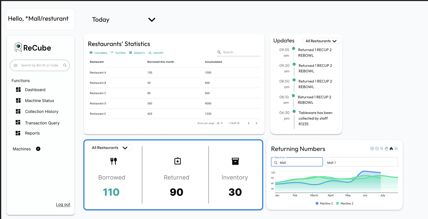
Recube partners with restaurants and malls to replace single-use packaging with a reusable container loop. As their sole UX and frontend designer, I built the analytics dashboard from zero, giving 50+ restaurant partners their first look at live inventory counts, return rates, and sustainability impact.

"I need to know at a glance if we're running low on containers. I don't have time to dig through reports during lunch rush."
The Problem

Partners were flying blind

The old interface was cluttered and static. No live data, no impact metrics, no quick way to act. Restaurant managers couldn't tell how many containers were in the field, or show customers any proof of their sustainability work.

Old Dashboard Interface

The old interface: cluttered, static, no actionable data

Research & Discovery

4 interviews, 3 user types, 1 clear pattern

I talked to restaurant managers, mall operators, and Recube's internal ops team. Every group wanted the same thing: data they could act on without digging.

4+
Stakeholder interviews
3
Distinct user roles mapped
~40%
Reduction in friction post-launch
The Solution

A dashboard built around two questions: what's happening now, and what's the trend?

I designed for two mental modes: quick-scan (is everything OK right now?) and deep-dive (show me the numbers over time). Live status sits front and center; search and filters are discoverable without any training.

๐Ÿ“Š Real-Time Inventory

Live counts of containers in circulation, in stock, and in transit, refreshed automatically

๐ŸŒฑ Impact Numbers

Waste diverted, COโ‚‚ saved, containers returned. Concrete numbers partners could put in front of customers.

๐Ÿ” Search & Filter

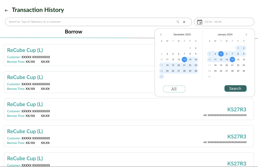
Find any record without exporting a spreadsheet. Filters by location, date, and container type

โšก Low-Stock Alerts

Notifications fire before stockouts happen, not after. Thresholds configurable per location

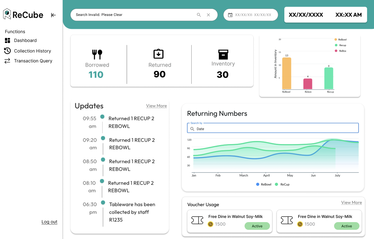
Dashboard Overview

Dashboard overview showing real-time metrics and impact data

Design Process

Research โ†’ wireframes โ†’ Figma โ†’ shipped

1. Information Architecture: Research surfaced two distinct use cases: quick operational checks and longer-term trend analysis. I split them into a live status view and a filterable data table, so neither user type had to dig through the other's workflow.

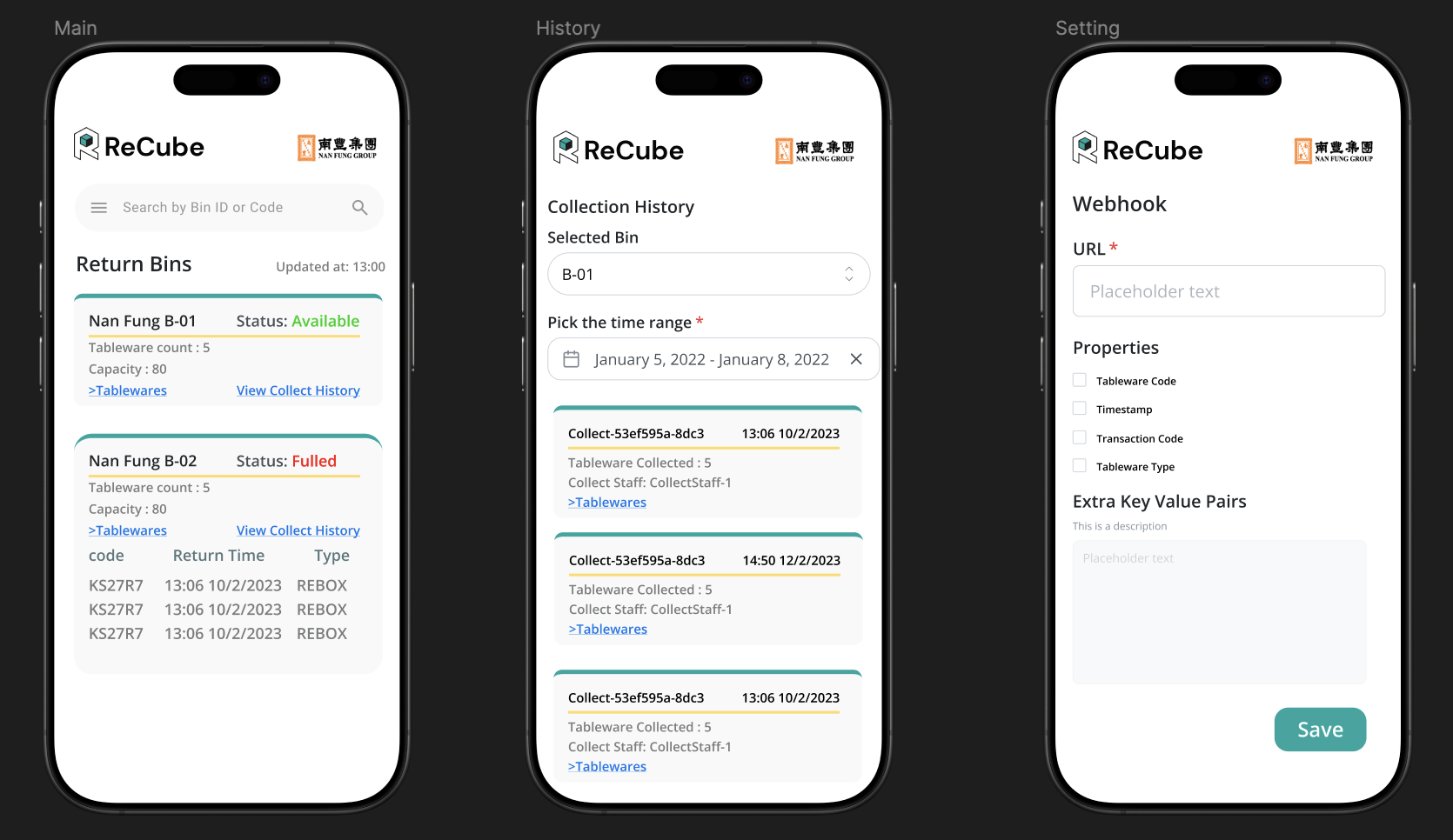
2. Wireframes: Low-fidelity wireframes let me validate hierarchy with stakeholders before any visual polish. The main call was what to show above the fold. We landed on inventory status and the three most-watched impact metrics.

Dashboard Wireframes

Early wireframes defining dashboard layout and hierarchy

3. High-Fidelity in Figma: Green palette tied to Recube's brand; high-contrast text kept data legible at a glance. I built a lightweight component library so the dev handoff stayed clean with no one-off styles.

Search Interface 1

Advanced search functionality

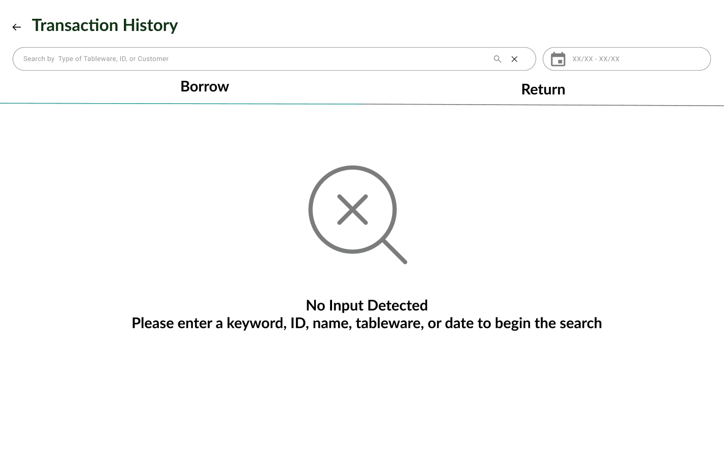
Search Empty State

Empty state and search prompts

4. Dev collaboration & QA: I sat in on sprint planning to flag anything technically risky before it got built. QA sessions caught edge cases that design reviews miss: empty states, loading skeletons, error messaging.

Impact & Results

Partners could finally prove their sustainability ROI

~40%
Reduction in user friction
50+
Restaurant partners using the dashboard
0โ†’1
Live inventory tracking (built from scratch)

"Now I can show customers exactly how many meals we've kept out of landfill. That's become part of how we market ourselves."

What I Learned

Three things I'd take into any data project

Show only what drives action. My first instinct was to surface every metric we had. Stakeholders pushed back, rightly, and we cut it down to the handful of numbers that actually change what someone does next. Less noise, faster decisions.

Live data needs defensive design. Real-time dashboards break in ways static UIs don't: stale data, failed syncs, partial loads. I had to design loading states, error banners, and refresh logic as first-class screens, not afterthoughts.

Impact metrics are marketing, not just data. When restaurant managers could see "412 containers returned this month," they started putting it on their menus. Numbers become stories when framed right. That realization shaped how I wrote every label in the dashboard.